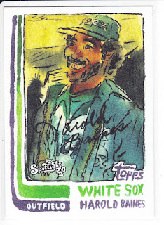
Cards are getting interesting lately. I appreciate all the different ways that cards are being created. Artists and celebrities create or dictate what a set should look like and who should be in it and suddenly it's for sale on a website.
It could be the most beautiful piece of artwork in the galaxy or a huge steaming pile of crap sent through the mail for a fee. It's all in the eye of the beholder. I would never intentionally try to yuck someone else's yum, but some of these cards are catered to my tastes, while most of them are not. Some look like a lot of thought and effort was put into the design and each brushstroke was a dazzling liquid diamond pouring out onto a mystical canvas until Leonardo Da Vinci wept salty tears of happiness at the pure ethereal joy birthed into the world. Others look like a second grader drew a spite portrait of the MLB player that crushed their hamster. In other words, it can be a bit of a mixed bag.
This offering by Andy Friedman, at first glance looks a bit off. It wasn't until I saw that the chosen medium was ink and watercolor, that I started to really look at the cards. I have painted some great portraits in my time as an artist, but watercolor is one of the most difficult to work with. Throw in ink to the mix and there will be some massive color bleeds in the journey to the final product.
The combination is not without its charms, but it will clearly not be everyone's favorite.
The White Sox have three cards in this release. Two cards in the regular set and one in a rookie insert subset.
29 - Harold Baines
33 - Jerry Manuel
R-8 - Gavin Sheets
Pablo Picasso, Mark Rothko, Georgia O'Keeffe, Vincent Van Gogh, Andy Warhol, Jackson Pollock and June Leaf each have distinct styles and some have widely ranging techniques. Some people love them. Some people loathe them. It's all a matter of taste.
I think it's absolutely wonderful that a variety of modern artists are getting their chance to explore and imprint their creative minds onto cardboard. Mixing baseball and artwork is a long standing tradition that goes back to the hobby's roots as advertisements for department stores and tobacco. It's a practice that fell out of fashion with the rise of the camera and occasionally has a resurgence.
I think that the most impressive feat in these types of cards are the risks that the artists are willing to take. It also takes great commitment on Topps part to keep these ventures going. All the efforts may not please all the consumers out there, but I don't think it was ever meant to.

